The Shaw Prize
The Shaw Prize, established in 2004, honours individuals for their significant contributions in Astronomy, Life Science & Medicine and Mathematical Sciences. Toby Ng Design was commissioned to create a new brand identity system that would provide both greater flexibility and visibility on an international platform.
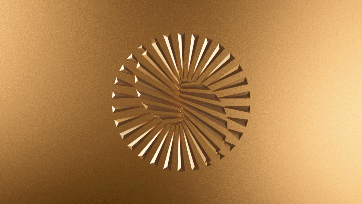
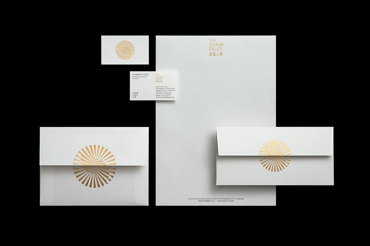
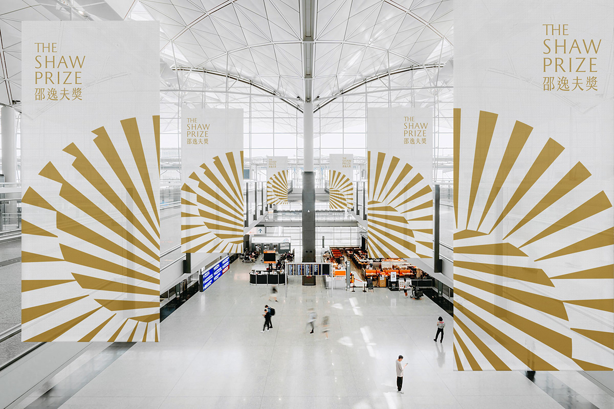
In pursuit of a more universal language, the symbol for The Shaw Prize was designed to embody the award and establish the foundation of its visual identity. The design of the symbol is multifaceted: it integrates the ‘S’ from The Shaw Prize, employs a radiant pattern inspired by natural laws, and forms a complete circle with the ‘S’ at its core, symbolising the universe. This design metaphorically encapsulates The Shaw Prize and the act of illuminating discoveries derived from the natural order. The symbol highlights the essence of The Shaw Prize and its commitment to recognising and honouring significant contributions in the scientific field.
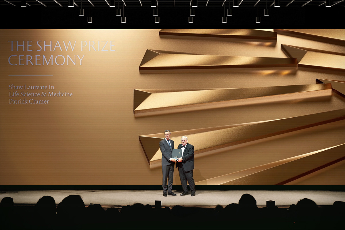
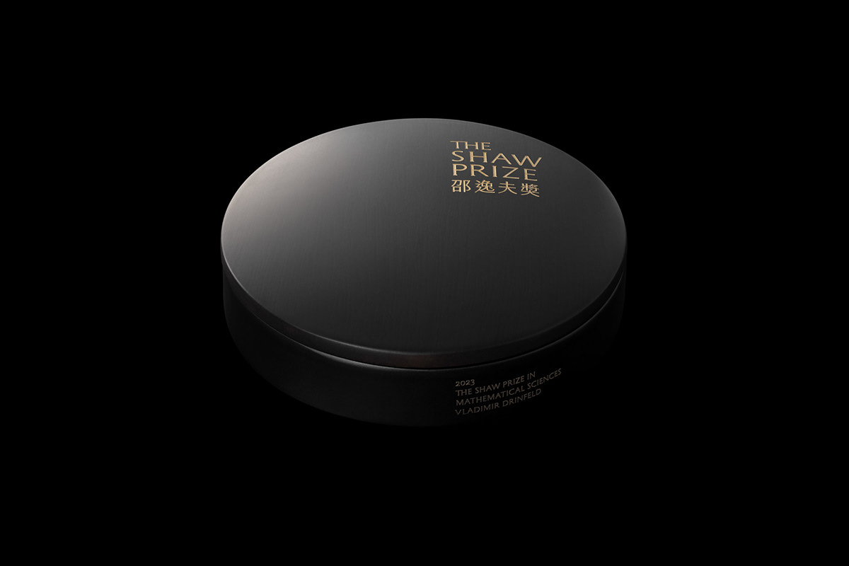
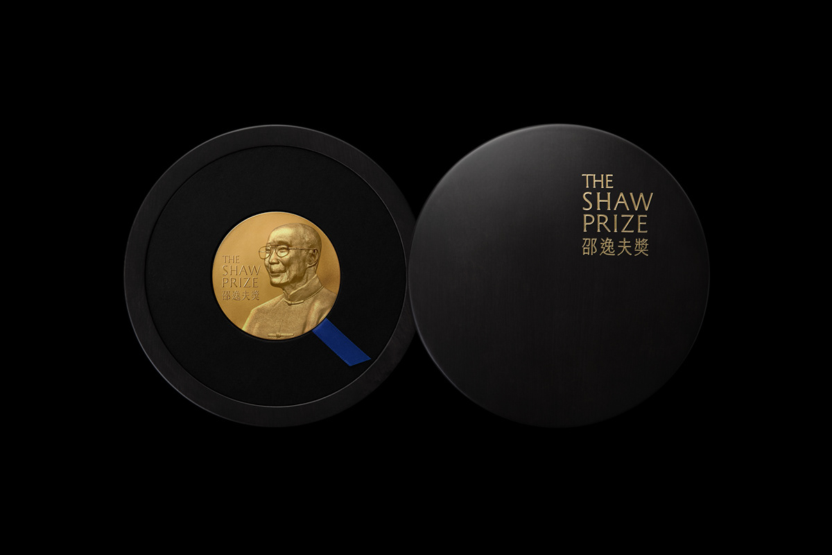
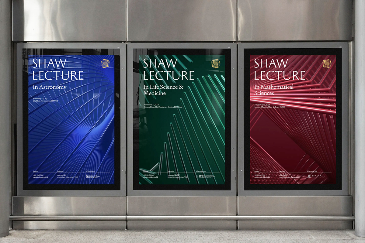
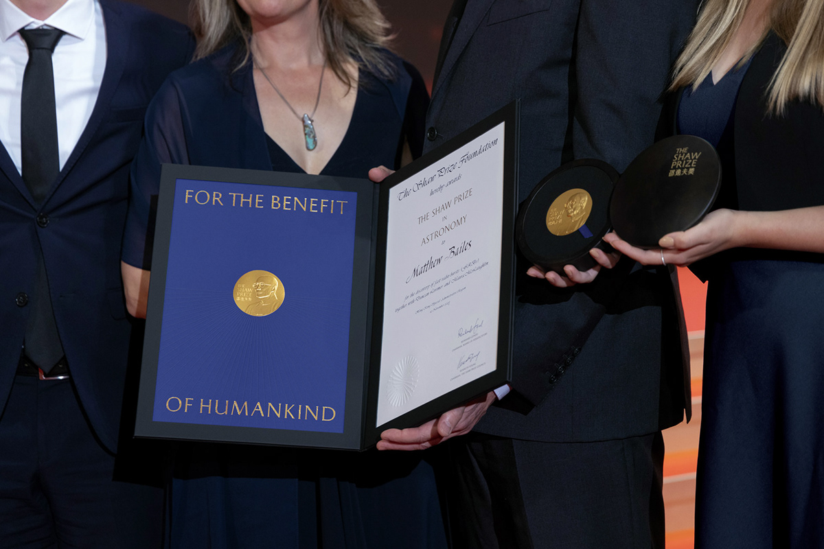
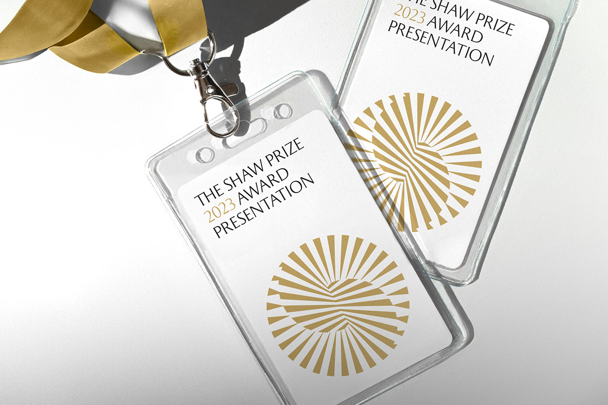
With a unique visual anchor, the brand identity is tailored to meet the diverse needs and mediums of the award. Notably, the solid gold medal, awarded to each laureate, has been thoughtfully redesigned to incorporate the brand symbol and is accompanied by a custom box and certificate. The brand identity is consistently adapted across various platforms – from the annual award ceremony, events, press releases, website, and social media presence, to print materials – to project a unified and distinguished image. A concise and classic colour palette brings coherence to the entire system, complemented by a secondary colour palette used to distinguish the different prize categories.
In pursuit of a more universal language, the symbol for The Shaw Prize was designed to embody the award and establish the foundation of its visual identity. The design of the symbol is multifaceted: it integrates the ‘S’ from The Shaw Prize, employs a radiant pattern inspired by natural laws, and forms a complete circle with the ‘S’ at its core, symbolising the universe. This design metaphorically encapsulates The Shaw Prize and the act of illuminating discoveries derived from the natural order. The symbol highlights the essence of The Shaw Prize and its commitment to recognising and honouring significant contributions in the scientific field.
With a unique visual anchor, the brand identity is tailored to meet the diverse needs and mediums of the award. Notably, the solid gold medal, awarded to each laureate, has been thoughtfully redesigned to incorporate the brand symbol and is accompanied by a custom box and certificate. The brand identity is consistently adapted across various platforms – from the annual award ceremony, events, press releases, website, and social media presence, to print materials – to project a unified and distinguished image. A concise and classic colour palette brings coherence to the entire system, complemented by a secondary colour palette used to distinguish the different prize categories.